Tuesday, October 23, 2007

Project 3 Finished.. Again..

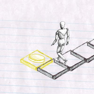
Okay so after a 2 week hiatus, we have modified our game based on Doug and Kah's feedback, Ashlee did an awesome job on getting the switches to work, so now the game is a little more complex. Glen took care of the sound, and did some nice footsteps and drawing sound effects, however we found the drawing sound was a little messy and so we decided not to bother with it in the end. Ashlee and I drew up some quick 'maps' of the level that appear briefly before the level loads, giving the player a chance to try and memorize the layout of the level. We also added colour to the unlockable tiles, and end of level switches. We used a unique colour for each level that related to the objects in the background. I feel this helped to distinguish the levels a little better. I guess we would of liked to get the overall game a little more polished ( such as a sound or animation when the switch is pressed, and getting the preloader working) but we were all pretty busy with other papers for much of the extra time and kind of a little bit over this assignment. However we are really wrapped with our finished game, And although I cant speak for Glen or Ashlee, I really enjoyed this paper and learnt loads.

Heres the finished game!
Click
Level 1
Level 2
Level3

Tuesday, October 9, 2007

Project 3 finished

Heres the link to our finished game!

The Adventures of Sketchboy!

We didnt really manage to get a lot of the interactive features we would of liked, but in essence the game is there and I feel we managed to pull off the visual asthetic really well. You control sketchboy through a series of mazes in ever increasing difficulty to try and find the switch to open the next level.

I realised I've still got a few things that I havnt blogged yet, So here is how i made the 'fading in effect'
In photoshop, I drew over the finished piece of text using my graphics tablet, in progressively darker layers. The process was fairly time consuming but worth it a it really fits in with the style we were trying to achieve.

Monday, October 8, 2007

Project 3 Update

So I met with my group today and we attempted to finish the game off.

We imediatley ran into problems when I tried to put all 3 levels on the same timeline. For example sketchboy became unresponsive and wouldnt move, and when the level was 'completed' and the inter level cutscene began to play, Sketchboy, and all of the game tiles remained on screen, ruining the cutscene.

I messed around trying to fix these issues but got absoutely no where, I just couldnt get the three levels and the cutscenes to work together happily in the same .swf. So I was forced to opt for a backup solution (that unfortunaely, isnt nearly as polished, but at least it works) of exporting the game as a series of seperate .swf's and linking these together via buttons.

On a completely unrelated note, Here is the initial intro clip I wanted to use, unfortunately when imported into the flash the clip lost quite a lot of quality and ended up looking fairly grainy and didnt really fit well with the higher quality visuals I had attempted to use for the rest of the game, So it was reluctantely scrapped.

Major issues

Okay, so I'll start with the good news.. I finished off the intro movie, and added a button so it links to the first map, but this is where the problems start to arrise, The map loads and draws everything fine, but for some reason the keys seem to have no effect and so sketchboy cant move.

Unfortunately Glen and Ashlee havnt really been able to figure out the iso hit test code so we are un able to put in any of the switches or anything that we wanted either.

With time almost out, I guess we will meet tomorrow and try and salvage something to show for Wednesday..

Sunday, October 7, 2007

Cut scenes

With Sketchboys walk cycle in the bag, my tiles done, and the backgrounds mocked up, I began working on the cut scenes. With time fast running out, and Kah's emphasise on keeping the visual integrity of the game constant, I decided to try and go for a simple but elegant approach. I started out by video myself drawing sketchboy by hand, my intention was to heavily speed this up into only 2-3 seconds and use it for the intro movie. However it didnt come out terribly well, and looked quite grainy when played at the game resolution (800 x 600)

So I decided to just draw sketchboy the way I did for the rest of the game, in photoshop with my graphics tablet. I drew progressively more of the character onto a series of layers and animated these which worked out fairly well.

For the inter level cut scenes, I wanted to go for a nice simple pan from one 'environment' to the next, I experimented with importing one large image into flash and motion tweening my way around it, but found flash didn't really deal with rotating or resizing the image very well, and the image lost quite a lot of detail each time. So I ended up doing it in another program, recording it, an importing the video into flash.

Here is a fairly rough version of the cut scenes all linked together (The levels will load and play where the clip currently pauses)


I still have to work on a final cut scene

Tuesday, October 2, 2007

Level design

Ive been working on the 'Backgrounds' for each of the 3 levels. We wanted each level to have different background images behind the tiles, and for these images to match the style of the tiles to be used on it. For example the first level with the very sketchy looking tiles, was to have quite a crude looking background.
Level 1
Level 2
Level 3

Level mock up

I took the rotoscoped frames, loaded them into falsh and lined everything up, threw on some basic walking code, and the Sketch Boy character was finished.


I passed this .fla on to the rest of my group and we each began experimenting with the code Glenn and Ashlee had been working on. I drew up some tiles in photoshop and animate them to appear as thoush they were being 'drawn in' and then incorporated these into the code. Im quite happy with how it turned out visually, but its still very buggy.


Rotoscoping Process

With the process and style of how I wanted the character to look, and the rest of my groups agreement, I began the immensely time consuming process of rotoscoping all of Sketchboys 4 isometric walk cycles.

I was perhaps a little over ambitious and opted for 14 frames per walk cycle, in reality I probably could of gotten away with 8-10 and it would of looked fine, but I initially didn't realise quite how long the rotoscoping would take.

56 frames and 12 hours later and it was done..

Here are the sprite sheets.. I hope they're worth it...

Monday, October 1, 2007

Project 3 Update

Ok so I realised I haven't really blogged any of my work for this project so far, so I will try and rectify this now by posting some of the bits and pieces I've been working on.


Here are some experiments I did on various techniques to get the sketchy hand drawn look I was after for sketchboy. In the first experiment I rendered out a simple walk cycle from 3DS Max, I then printed these frames out, traced them by hand and then scanned them back in. Although it was quite quick to do, I felt the finished piece looked quite flat and lacked detail.


Next I tried drawing over the frames in photoshop using the line tool, this was quite slow going, and I wasn't really all that happy with the results.


Lastly I tried drawing over the frames with the pencil tool, and used a Wacom to do so, This was much faster than using the mouse and produced a much better result.

Tuesday, September 11, 2007

Project 3 Design Document

Here is our groups Design Document.

Clicky

Tuesday, September 4, 2007

Project 2 Finished!

Side Scrolling

Final .swf

With the 11th hour fast approaching, I went and saw Dan for advice on how to fix the hit test issue. Dan worked out that the problem was the code I had written simply told the main movie clip to go to the hit movie clip, and as a result, for as long as the hit test was true, the main movie was continuously being redirected to the start of this hit movie clip, rather than being directed to it once, and then have it play. Dan showed me how to fix this by setting up a counter which, when the hit test was triggered, would start increasing until it reached 40 (the length of the hit movie clip) and the revert back to zero, and this counter was used to directly cycle through the frames of the hit movie clip when activated. Simple eh? I then made it so this would only happen if the duck key was not being pressed, a little bit more tweaking to do with the area of the hit test (so it is only activated when the block comes in contact with the monkeys head, rather than the start of the monkeys movie clip, which is back by his tail) and it worked almost perfectly (if the monkey is walking backwards when he gets hit there are issues, but i didn't really have time left to fix this)

I also added a basic preloader as i noticed the size was getting pretty big, and when the .swf loaded in the browser, it do so a layer at a time, which looked pretty awful.

Apart from a few changes not really worth mentioning that pretty much wraps up this environment. I'm really happy with how it worked out. It would of been cool to add some sound effects like footsteps and impact noises but time didnt allow it.

Isometric Environment

Final.swf

The isometric environment was a bit of a mixed bag to be honest, after not reading the brief properly initially (My own fault) and as a result only starting it about half way through the assignment, and then with less than a week to go working out that my current approach was pretty unfeasible, and having to basically start from scratch, this environment didn't get as much time as the side scrolling, isn't nearly as polished. I still couldn't get the character walk animation to stop playing once the key is no longer being pressed, and the scrolling isn't perfect. Although i feel I have managed to modify it pretty heavily form the original tutorial i based it on.

Overall I really enjoyed this assignment though, and learned heaps.

Monday, September 3, 2007

Project 2 update

Side scrolling environment

After spend several more hours trying to get the his test to work, I had achieved little, and was very frustrated. I managed to get the actual hit test working, but couldn't get it to play the movie clip associated with it, it would go to the first frame of that movie clip, but no matter what I did, I just couldn't get it to play! So i couldn't even begin to write the presumably more difficult part of the code, where pressing the duck button avoided this. With time fast running out I'm really not sure I will be able to get it to work, So I have included the "get hit, fall down and get back up again" clip anyway (Space button) so the hours I spent on trying to get it to work wont have been a total loss.

I also fixed the issue I had with the ground movie clip only playing through once in reverse. It now moves back and forwards almost seamlessly.

I had another go at the blocks whizzing around in the background, and felt i pulled them off a lot better this time. I might tidy their timings up a little bit though.

All in all I'm pretty happy with the environment, it just needs a few minor tweaks here and there. ideally I would like to get the hit test - falling over animation working, but with just one day left I think that might be pushing it.
Isometric environment
0.5
Ive spent a good part of the last two days going over the tutorial I used for this one (written by Tony Pa) some of the code dealing converting the characters placement into isometric is pretty heavy and I don't quite understand it fully. Also I just cant get (!Key.isDown()) to work, So the character refuses to stop playing the walk animation if he is stationary. This has really perplexed me as to why it wont work and have tried just about every thing to fix it, from having 'static' frame in the movie clip and using the gotoAndStop command, to stopping the whole movie clip, and Even stopping the entire _root movie clip, but the (!Key.isDown()) just seems to have no effect.

As I started to get incredibly frustrated with this I decided to move on to something else, I wanted the environment to scroll as you neared the edge like in my side scrolling environment, I messed around with a few ideas, such as moving the entire movie clip if the characters x and y position crossed a specific thresh hold near the edge of the screen, but the once the character was over this thresh hold, the screen would continue to move in this direction(as he is still over thresh hold), even if the character was now moving in the opposite direction. In the end I had to settle for moving the entire movie clip when the corresponding key is pressed, Although this works, it has two major issues . Firstly, because the entire movie clip is constantly changing position, this chews up quite a lot of processing power and seems to slow the file down quite heavily. Secondly, the environment moves at the same speed as the character, so most of the time he stays in the center, but if he hits an un walkable tile, and stops, and you are still pressing the walk key, the environment will continue to move, as its movement is dependant on the key press, not the characters movement, so it is possible, to get the character stuck behind a wall and move the screen until he is out of view.

I made a few new tiles to improve the appearance of the landscape, and made the array a lot bigger so there was at least something to explore.


I'm feeling a little less confident about this environment, with only one day to go there are still alot of issues I need to iron out and to be honest Ive got no idea how to fix them.

Saturday, September 1, 2007

Project 2 Update

With my side scrolling map coming along nicely, I thought I should post some progress of my Isometric map.


0.1 (click for .swf)
I started off rendering out my characters walk cycle from an isometric view, I rendered out the sequence 4 times, one for each direction of movement (Left, Right, Up, Down) and then imported these files into flash and codded the keys for them.


I Rendered out an isometric ground plane, to be placed behind the character in flash. For some reason I had great difficultly getting this to work how I wanted (The map was static and the character moved, when the character nears the edge of the screen, the screen moves too. much like the system I used in my side scrolling version, simple enough right?) After speaking to Kah about this, we eventually got it to work relatively well. unfortunately this little glitch was a sign of things to come..


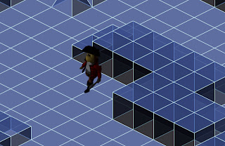
I modeled a more complex environment in 3ds max, I separated this into 3 layers - the ground plane, the edge of the environment, and the shapes and rendered and imported them into flash individually. My plan was to lay these out on the stage, and using the swapDepth command, bringing each element forward or back, depending on where the character was giving the appearance he was moving in front/behind the objects. However after messing around with the code for several hours and going through several online tutorials, I was getting no where, i Just couldn't get the swapDepth command to work properly. At this point I also realised I had no idea how I could get the hit test command to work either, because the blocks where angled, but the movie clips were square, if I used a simple hit test, empty parts of the movie clip that *should* be walkable, would instead block the character.Arrhh!! Everything was going wrong. My attempt the avoid using some tricky array by using pre-rendered movie clips was getting nowhere.

top layer - the blocks

Middle layer - The map edge

bottom layer - The ground plane


0.4
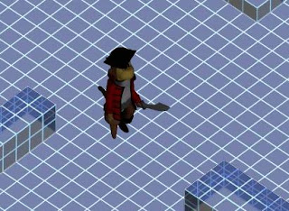
I decided to bite the bullet and throw away my previous idea and just draw the map through code using an array. I found some nice tutorials on isometric tile based games and used one of these as a base for my map. I am slowly getting my head around the code, and have got it working relatively well. Here is the basic environment so far, I am quite happy I managed to recreate most of the aesthetic I had previously achieved with my rendered images.

Monday, August 27, 2007

Project 2 Mega-Holiday-Update

I realised I hadn't updated the ol' blog in a while, So I thought I better post some updates. I felt it would be easier to show my development by breaking them up into separate 'versions' and explaining each individually, rather than just one big wall of text.
So Here goes..

0.1 (Click for .swf)

My first attempt at the code for the environment, When either the left or right arrow key is pressed, the background objects scroll and the ground animation plays, giving the illusion of movement.

0.2

I altered the code so now the environment only starts to move when the character nears the edge of the screen. I feel this is a much better result, as now it actually feels like you are moving the character around a space, rather than a scrolling background.

0.3

Added a 'midground' and foreground layer of objects, each layer moves at a different speed, to enhance the parallaxing effect.

0.4

Added a short background clip of some blocks flying around, its very jumpy because I only rendered out a few frames to test it out. Not really very happy with it to be honest, its quite 'busy' looking and distracts from the foreground, and I don't think the scale is quite right either.

0.5

Ditched the background idea after quite a lot of time messing around with particle systems and stuff in max, I liked the concept of lots a blocks whizzing around in the background, but I just couldn't get it to look good in the game, Might have another go at it later though.

I also felt objects in the environment looked quite flat and ruined the realism, My problem was, that if i rendered out the blocks from an angle to show their depth, and then motion tweened this image across the screen, when it got the the other side, and thus was being viewed from the opposite angle, It looked wrong and completely ruined the effect. Originally I wanted to render out each frame of motion for each block as it moved past, but after some quick experiments I realised this would require well over 1000 frames, and increase the file size of the final .swf exponentially.

So in the end I had to stick with my initial idea of just motion tweening a single image across the screen, but through clever use of rounded shapes (such as cylinders and cones) and angling the rectangular shapes carefully, I feel its quite hard to notice the perspective issues. So I'm happy with it.
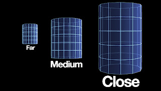
I rendered out each shape three times from different lengths, rather than just resizing one image as i previously did as this also turned out perspectively incorrect.

0.6

I had another go at this background, this time using just a simple gradient, fairly happy with the outcome, might add some more detail later though. I also slowed down the speed at which the ground scrolled as it was a little too fast for the character, However this brought up a new problem, when the character stopped moving the jump between the current frame of the Moving ground clip, and the single frame of the static ground image became a lot more noticeable. I fixed this by re writing the code so instead of the ground having 3 separate movie clip states (Backwards, static, forwards) it just had one state (Forward), which played when the character nears the edge, and stops when he moves away, and plays in reverse when he nears the other edge. Simple and it works even better! there is now no jump at all. But.... the clip only seems to play through once in reverse. I couldn't find a proper 'play in reverse' command, i had to use 'Previous frame', which only works until it gets to frame 1. Will try and fix this later if i can work out how.

A few background gradient examples, Although I liked the darker ones better, they made a faint white outline appear around the character so i just when for a simple light gray one.

0.7

I was happy with how the environment was coming together visually, but wasn't really any fun to explore. You just pressed either left or right and that was it. So I added another small monkey character who leads you to a goal at one end - A treasure chest. When you reach the chest, a clip of it opening plays and the environment stops scrolling, signalling you have reached 'The end' of the map.

I still felt this was pretty linear and pointless, so i came up with the idea of having to duck some flying blocks along the way. I animated a duck sequence (Down key) and a 'getting hit and falling over then climbing back up' sequence, and tried to get some collision detection working, but didn't have any luck. Will keep at it though.

Phew. That does it for now. Ive also been working on my second file, an isometric map, will post some updates on that later.

Monday, August 13, 2007

Project 2 Update

Over the last couple of days Ive done a few tests at trying to create the aesthetic i am after for the environment, I will begin getting into the code once Ive got the look right. I started by simply taking my basic environment from my previous test and rendering out a wireframe version to get the 'Tron' look I was after. I felt this test was pretty unsuccessful as the end result looked quite messy and the character just didn't fit it, Also the environment was fairly static looking.


I went back to the drawing board and put together another basic wireframe environment, this time with a white background and more opaque to clean it up a little. I wanted to have a go at parallaxing so I animated and rendered a few frames of the ground plane, as well as static frames for each of the cubes. I imported these into flash and using the motion tween, animated the blocks at various speeds to give the illusion they are moving with the background. I felt this test was far more successful, However as the blocks are only a single frame each, they look very flat, I'm not really sure how I can fix this, but i will keep at it.


I also felt my blog was getting a bit messy and it was hard to follow my progress. So Ive started uploading my experiments to youtube, although the quality isn't great they are a bit easier to watch this way, I also uploading a few of my earlier tests and reposted them below.

Here's the previous experiment I did, just testing my character in between a background and foreground layer in flash.


And heres the final 3d walkcycle, compared to my original 2d version.

Friday, August 10, 2007

Project 3 Proposal update

I made a quick walk cycle example of how I want sketch boy to look. I rendered out a sequence from 3ds Max, and then drew over each frame in photoshop to create a nice sketchy rotoscoped look.

Sketch boy example

Tuesday, August 7, 2007

Project 3 Proposal

After spending the past two weeks working on project 2, and creating a rich 3d aesthetic, I wanted to go in a different direction for project 3. I really liked the simple black and white outline look of the game we looked at earlier, Flyguy.

Using Flyguy as a precedent, I came up with my own character 'Sketch boy' by rotoscoping an image of an artist mannequin. I wanted to create a really low-tech hand drawn kind of feel to the game, as though somebody is drawing it as you play.

As far as gameplay is concerned, I think scrolling would work best, but I could see it working in other forms, such as isometric or even top down. The player, controlling sketch boy has to complete various puzzles to make it through the game. The puzzles are in the form of completing the landscape through filling in gaps in the landscape by drawing. Sketch boy only has a limited amount of ink to for each level so the player has to use it sparingly or they Will be left stranded. There will be switch's scattered through out the map, that will toggle parts of the landscape on/off. Which need to be tripped to complete the map.

A mock up of the sketchy style I want to use.

Project 2 Update

I have just finished rigging and animating the 3D version of my characters walk cycle, I used images of the original 2D cycle as a guide for the animating, but adjusted a few things such as the shoulder movement to make it look a little more natural. I rendered the animation out as a sequence of TGA images and then loaded them into flash where I placed them on the time line, each as separate Key frames.

I also quickly put together a basic environment of simple cubes to test in flash, I separated this into two separate layers, the foreground cubes, and background cubes and floor, and rendered these out separately. I then loaded these into flash and exported out a quick test. I am fairly happy with the result, but there a few things I would like to improve, such as the faint outline around the character, and perhaps a shadow for the character.

Here's a link to the test .swf

I have also been giving quite a bit of thought as to what I want the environment to look like, I didn't really want to take a normal landscape such as a city or jungle and simply model it in 3D, as for one, I don't think my 3D skills are quite up to it, but more importantly i don't think it would be terribly interesting. So I decided to go for quite a cartoony/artificial look.I found this image while searching for inspiration and felt the wireframe style of the hand was prefect, its just the sort of artificial/computerish look I wanted. I found a few more examples that also use this style, and I think are very effective.

Coincidentally this image also depicts a 2d Character being transformed into 3d

Tuesday, July 31, 2007

Project 2 update

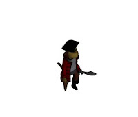
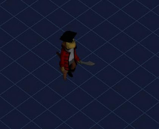
I spent the afternoon experimenting with getting some 3D renderings of my character, similar to what was done in my research. In the end I created a full 3D model, taken exactly from my 2D vector character, which can be easily animated, rendered, and turned into a sprite animation in flash. My character was fairly simple to model, although the jacket and hat were a little frustrating to get right, and I'm still not completely happy with either yet. Overall I am pleased with my progress so far and now I confidently feel that I can use the technique i looked at in my research to create a nice looking landscape for my character.

Here's a shot of the original vector image, and the final 3d Model
A couple of Development shots


And a few more shots of the finished model

Monday, July 30, 2007

Project 2 Research

I began my research by thinking of some of my favourite video games, and what I really liked about them, after completing project 1, and with monkeys still on the brain the first to come to mind was Donkey Kong Country (1994 SNES) (and its sequel Donkey Kong Country 2: Diddy Kong's Quest (1995 SNES) which I loved even more!) This graphics of this game really blew my mind, it was the first time I had seen such fluid and convincing computer animation. Somehow the game designers had managed to create what appeared to be a flowing 3 Dimensional landscape and characters, on a system that was nowhere near capable of doing so. This was done through a revolutionary technique at the time, what Nintendo referred to as ACM, or Advanced Computer Modelling.
Using the latest Silicon Graphics workstations, the designers created full 3dimensional characters and landscapes, and then converted the 3D renderings into 2D backgrounds and sprite animations. Although by today's standards the 3D is very primitive, at the time it was a window to the future.

I really like the idea of using 3D rendered images in a 2D scrolling game to create a really simple faux 3D game, I think using this technique and 3ds Max I can create a really impressive looking world for my character to explore. I have begun playing around in Max creating a 3d version of my character (As I feel using the very flat looking vector character will look quite out of place in front of rendered backgrounds) I will post some progress shots of this up shortly.
Here are some Donkey Kong Country images


And heres a video of gameplay, as well an interesting a "Behind the scenes" video (Beware, its very 90s..)


Tuesday, July 24, 2007

Project 1 Final


'Fang' - The Monkey PirateI have come up with a lycanthrope character that is half monkey/chimp half pirate. His facial features are predominantly simian in style, with a few exceptions such as his eyes that I have left distinctly human. His Posture and walk are also very human in nature, as is his dress. I included a peg leg to give him an interesting lop-sided walk cycle and to help stylise him a little more. Although he carries a large sword and has quite a gruff appearance, he is really very kind and pleasant, but a little cheeky..


Update

Have been pretty tied up with other assignments the last couple of days, id sort of put my character on the back burner for a while, hence the lack of updates. I Decided to re-do my sprite sheet and walk cycle to make it more complex and interesting by adding details like a bending knee and the jacket moving etc.


After spending most of the evening on it I got quite stuck on the final part of the cycle, after his peg-leg moves in front of his right foot, and then the two legs meet again in the middle to restart the cycle. There was this weird kinda slidy thing going on with both his foot and peg-leg moving at the same time, it just didn’t look natural. So I checked out the internet for other examples of walk cycles incorporating a limp/peg-leg, and found this, after studying it for a few minutes I worked out my mistake and quickly fixed it, with the walk cycle now complete I just have to add the action script.

Found Peg-leg example clip -'MattEl' December 28, 2006


Tuesday, July 17, 2007

Sprite Sheet

Here is the initial Sprite sheet I have come up with, I came up with this adaptation of this character after completing the Adobe character animation tutorial in the links section, and thus is a little stylistically different to my previous direction, But I am happy with this result, which is a little more cartoonish than I was originally going for. The motions are hive him walking, and slicing with his sword.